Dashboard (Statistics Tab)
The Dashboard allows you to analyze replication data over a period of time based on the contents of a specified Syniti DR Metadata and history file or database. It can provides information for each table in a selected set of tables including:
-
Total number of processed records
-
Total number of failed records
-
Total number of records
-
Total number of replication sessions
-
Total number of processed records by all replications per unit of time.
-
Average time it took to replicate specified records.
If you are interested in obtaining this type of information about your replication environment, and plan to use the Dashboard regularly, set both the log and history to save to a database rather than a file. This speeds up the data loading process. The Dashboard works also when using log and history files, but data is only loaded from the current history file. Additionally, if the history has been enabled only for a short period of time, the results shown in the dashboard are limited and therefore less meaningful.
Steps for Using the Dashboard
Use the following steps to gain a basic understanding of Dashboard functionality. For more information, see the description of each area of the Dashboard below.
1. Select a time interval by expanding the time interval area and using the yellow scroll bar to adjust the default time.
2. Using the Replication Groups and Selected Replications areas, select which replications you would like to examine in the Dashboard.
3. Using the Dashboard Chart menu, or the Overview and Throughput tabs, choose which type of chart to view.
4. In the chart display, expand or reduce the amount of data displayed in the chart using the horizontal scrollbar or mouse wheel.
5. In the Overview Chart, the bar chart displays processed records for each table. Click on one of the options below the chart to change the line chart in the display. Note that the right y-axis scale for the line chart changes depending on the data displayed.
6. In the Throughput Charts, modify the time units displayed using the buttons at the top right of the chart area.
Dashboard Layout
Selected Time Interval
The dashboard automatically loads data from the last week of execution (if available in the history). In the example below, data from 11/1/14 to 11/8/14 because that is the most recent data available from the history.

To change the time interval displayed:
-
Click the down arrow on the left to expand the time selector.
-
Use the horizontal yellow scrollbar to adjust the time period displayed:
-
Use the mouse wheel or drag the end of the scroll bar to change the time period (days, weeks, months) of the whole axis
-
Use the left mouse button on the scrollbar to expand or contract its size
Replication Groups
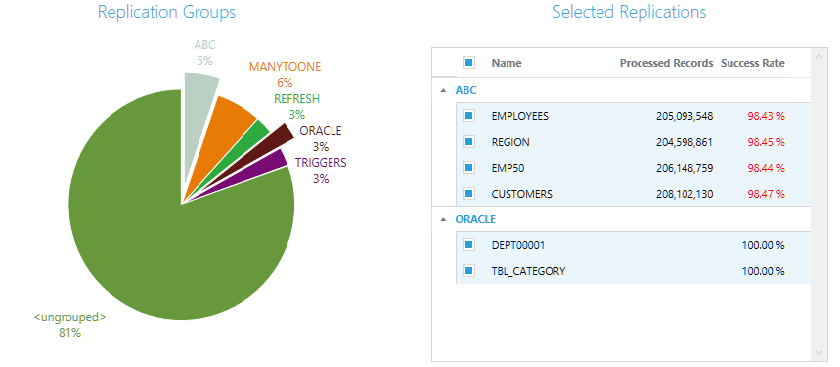
This area displays a pie chart with all groups belonging to the metadata. The chart legend shows the name of the group and a percent, which is the number of replications belonging to the group in relation to the total number of replications.
If a group has 0 replications, it is not shown in the chart because there is no historic data to analyze. A section of the pie chart called <ungrouped> collects together all replications that are not assigned to a group.
To select a group, click on the portion of the pie that belongs to it. The group section will be raised from the pie area to show selection. When no group is selected, all other charts show empty data. Charts are loaded only when at least one group is selected.
Selected Replications
This area displays the list of replications from groups selected in the pie chart. Use the checkboxes next to each replication to select or deselect specific replications and obtain a more fine grained analysis of the processed data.
Dashboard Charts
The menu list on the left of the Dashboard tab shows the options available for the performance charts. Select from the following:
-
All sessions (both mirroring and refresh sessions)
-
Refresh sessions
-
Mirroring sessions
You can also choose which type of chart to view:
-
Overview Chart
Shows information on the number of processed records compared to failed records, total records and sessions for a specific time interval -
Throughput Charts
Shows the processed records not related a replication but to a single time frame inside the selected time interval.
Overview Chart
This is a multi-axis chart that shows multiple sets of data with a different y-axis, depending on the data displayed. The column bar chart displays a single bar for each selected replication. It shows the number of processed records. In addition, the chart can display total records, failed records or sessions in the selected time interval.
-
Columns are colored to match the group as shown in the bar chart. If the processed records are different from the total records (i.e. some failed records), the column bar color is faded.
-
The Y-axis on the left (green) shows the number of records. To see the actual number of records for table as a tooltip, move the mouse pointer over the column.
-
Use the horizontal scrollbar to see replications beyond the current screen area.
-
Use the mouse wheel, or drag the scroll bar, to enlarge or reduce the amount of data shown in the screen area.
-
Choose an option below the chart to display the line chart (associated with the right side of the Y-axis) that shows the number of total records (in blue), the number of failed records (in red) or the number of sessions (purple) in the selected time interval. Check the scale on the right y-axis to compare data volumes.
Throughput Charts
The Throughput Charts show the processed records in relation to a single time frame within the selected time interval. This display can be used to evaluate the number of records processed per unit of time and therefore the workload of the Replication Agent for all replications in the current selection.
The display shows two different charts aligned one above the other, but joined by a common X-axis showing the time period. The top chart counts the total number of processed records by all replications per unit of time within the time period. The bottom chart shows the average time it took to replicate all the records shown in the data above.
-
Move the mouse over a section of either one of the charts to observe the change in the counters at the top to show the actual values for the section.
-
Use the buttons at the top right of the display to select different time units: per hour, day, week or month.
-
Use the mouse wheel, or drag the scroll bar to shift the charts horizontally or enlarge/reduce the area displayed.
Opening the Dashboard (Statistics Tab)
In the Management Center Metadata Explorer, expand the tree to show Metadata entries. Select a Metadata name. From the right mouse button menu, choose Show Dashboard.
Related Topics
Reviewing
Replication Performance Over Time
Replication Agent Options:
Log Settings